
Introduction
As a programmer, I understand that designing websites can sometimes feel overwhelming, especially when our personal projects lack a strong design element. But don't worry, I've been there too! Over time, I've picked up some valuable tips that have helped me improve my design skills. In this post, I'd love to share a few of these tips with you. By implementing these strategies, you'll be able to enhance your design abilities and create visually appealing websites.
Get Inspired by Other Websites
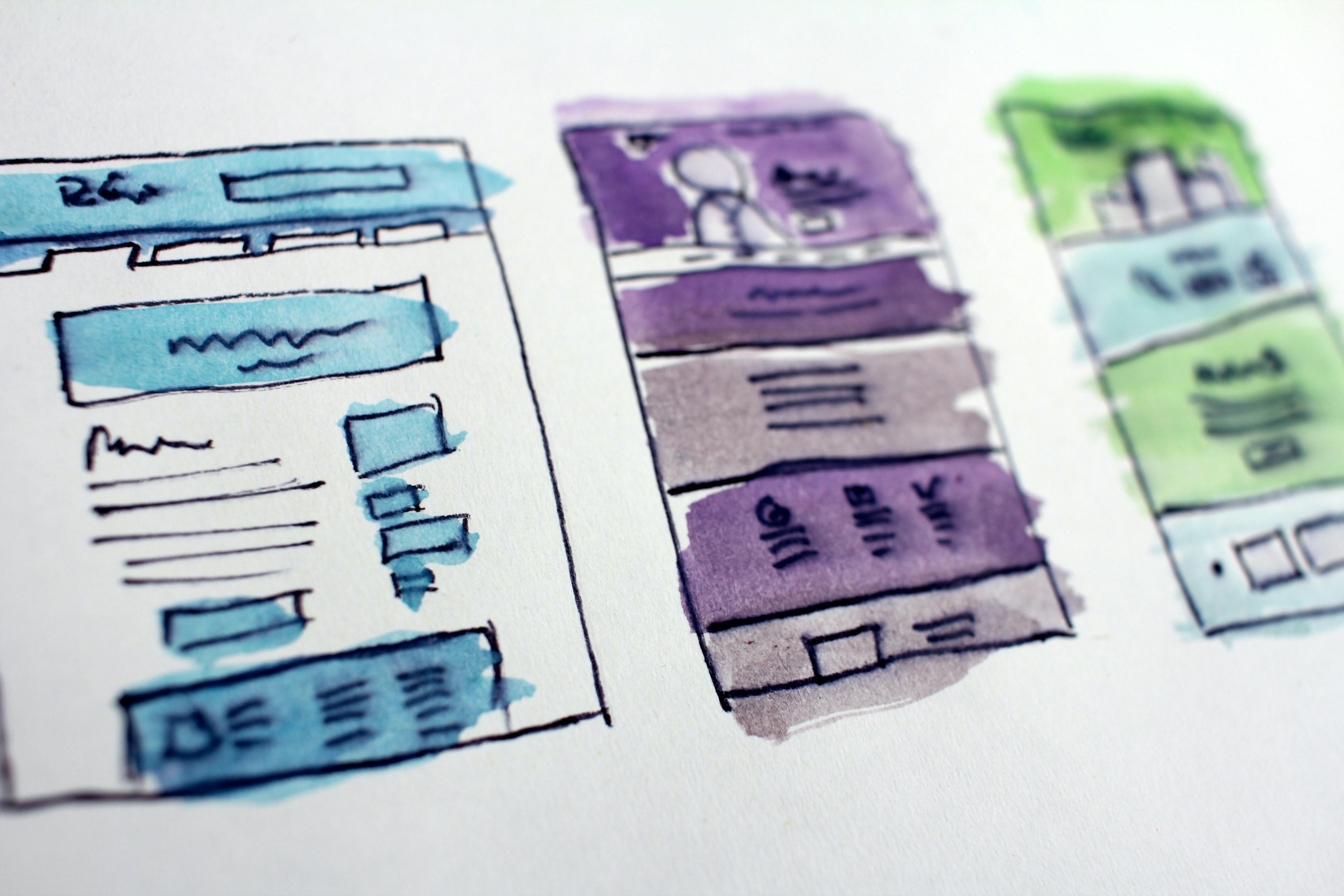
One of my favorite strategies is to draw inspiration from other websites. Exploring well-designed websites can give you insights into successful design choices and innovative approaches. Take the time to analyze and deconstruct the elements that make these websites visually appealing and user-friendly. By studying and understanding the design principles employed by other websites, you can expand your design repertoire and incorporate fresh ideas into your own designs. Remember, inspiration is not about copying. Use other websites as a source of inspiration to spark your creativity and adapt their ideas to suit your unique design needs and goals. I personally like to take elements from different websites, make some tweaks, and blend them into my work.
When it comes to design, understanding and applying basic principles is essential to create visually appealing and balanced designs. Here are a few key principles to consider:
- Color Contrast: Choosing colors with sufficient contrast ensures that text and important elements are easily readable and distinguishable. High contrast between foreground and background colors improves accessibility and legibility.
- Padding: Proper use of padding, or the space between elements, helps create a sense of visual balance and organization. Sufficient padding around elements prevents them from feeling cramped or cluttered, while also improving readability and user experience.
- Typography: Selecting appropriate fonts, font sizes, and font styles contributes to the overall look and feel of your design. Consider factors such as readability, hierarchy, and consistency when choosing typography for your interfaces.
- Whitespace: Whitespace, also known as negative space, refers to the empty areas between elements in a design. Effective use of whitespace helps create a clean and uncluttered layout, improves readability, and directs the user's attention to key elements.
- Alignment: Consistent alignment of elements creates a sense of order and cohesion in your design. Whether it's left-aligned, centered, or justified, choose an alignment that suits your design goals and maintains visual harmony.
- Hierarchy: Establishing a clear visual hierarchy guides the user's attention and helps prioritize information. Use varying sizes, colors, and styles to differentiate between headings, subheadings, body text, and other elements.
- Consistency: Consistency in design elements such as colors, typography, and spacing creates a unified and cohesive look. Maintaining consistency throughout your design enhances user experience and helps establish brand identity.
Experiment with different design tools and software
You can also explore design tools like Figma to enhance your design capabilities. Figma is a popular design tool that offers a wide range of features and collaboration options. With Figma, you can create and prototype designs, collaborate with team members in real-time, and easily share your designs with stakeholders. By incorporating Figma into your design workflow, you can take advantage of its intuitive interface and powerful features to bring your design ideas to life. Experiment with Figma and discover how it can expand your design capabilities and streamline your design process.
Apply Responsive Design Principles
To create a seamless user experience across various devices, it's crucial to design interfaces that adapt well to different screen sizes and devices. By incorporating responsive design principles, you can ensure that your designs are optimized for a wide range of devices, including smartphones, tablets, and desktop computers. Responsive design involves designing and developing websites in a way that allows them to automatically adjust and respond to the user's device and screen size. This ensures that the content and layout remain visually appealing and functional, regardless of the device being used. By embracing responsive design, you can provide a consistent and user-friendly experience to your audience, regardless of the device they choose to access your website on.
Stay Updated With Design Trends and Best Practices
Just like programming, design is a fast-evolving field, and it's important to stay current with the latest trends and best practices. Regularly reading design blogs, like this one, can keep you informed about the latest design techniques and methodologies.