Introduction
Chakra UI is a css framework for React based apps. It is super easy to use which makes for a smooth developer experience. I've been using Chakra UI for over a year now and in this time I've learned a lot about it. In this post, I'll show you 5 Chakra UI features that will take you from beginner to advanced.
Custom Theme Multiple Files
When you override the default theme, most developers create one theme file - usually named theme.js. When your project gets larger and you have multiple components and multiple overrides this file will get long and hard to read. To fix this we can use multiple theme files. It will look something like this: We can create a folder named theme. Inside of here create a file named index.js. This will be the main entry point for our theme. It is where we will use the extendTheme hook and pass in the overrides.
📁 theme
  📄 index.js  # my main theme entrypoint
  📄 styles.js  # all my global style overrides
  📁 foundations
    📄 borders.js  # all my border overrides
  📁 components
    📄 button.js  # all my button overrides
You'll notice we are importing a few other files. styles.js will be all of our custom style overrides. For example color, fonts, etc. The foundations folder will hold our Foundational style overrides and the components folder will hold all of our component style overrides. By splitting it up like this, we create a project that is scalable friendly.
// theme/index.js
import { extendTheme } from '@chakra-ui/react'

// Global style overrides
import styles from './styles'

// Foundational style overrides
import borders from './foundations/borders'

// Component style overrides
import Button from './components/button'

const overrides = {
  styles,
  borders,
  // Other foundational style overrides go here
  components: {
    Button
    // Other components go here
  }
}

export default extendTheme(overrides)
useBreakpointValue
Normally to create responsive values in Chakra UI you do something like this:
<Text fontSize={[10, 20, 30]}>I am responsive.</Text>

// or

<Text fontSize={{ base: "24px", md: "40px", lg: "56px" }}>I am responsive.</Text>
However, some properties like variant and size don't accept this. For these properties, we need to use the useBreakpointValue hook. By using this, we can achieve the same effect as the array and object syntax.
function Example() {
  const variant = useBreakpointValue({ base: 'outline', md: 'solid' })

  return (
    <VStack align="flex-start">
      <Text>Resize your window to see the button variant change</Text>
      <Button colorScheme="teal" variant={variant}>
        Button
      </Button>
    </VStack>
  )
}
useMediaQuery
mediaQuery is an advanced css feature but Chakra UI makes it easier to use. You might be thinking, why do we need this if we already have custom breakpoints? Well, you might want to add a breakpoint that is not defined in our custom breakpoints to only one element. To use this, simply use the useMediaQuery hook and pass in your value. Then use the variable in the code!
function Example() {
  const [isLargerThan1280] = useMediaQuery('(min-width: 1280px)')

  return <Text>{isLargerThan1280 ? 'larger than 1280px' : 'smaller than 1280px'}</Text>
}
config
There is a property called config which is passed into the extendTheme hook. This property takes in 3 global theme config properties which most people don't use.
const config = {
  initialColorMode: 'light',
  useSystemColorMode: false,
  cssVarPrefix: 'coffeeclass-io'
}
The first is initialColorMode. This is the initial color mode that will render when the user gets to your site.
The second is useSystemColorMode. This is a boolean value that tells Chakra UI to use the system color mode (or not if it's set to false).
The third is cssVarPrefix. This is the prefix that Chakra UI will use for all of its css variables. It does not change any of the behavior but it is a cool way to further personalize your app.
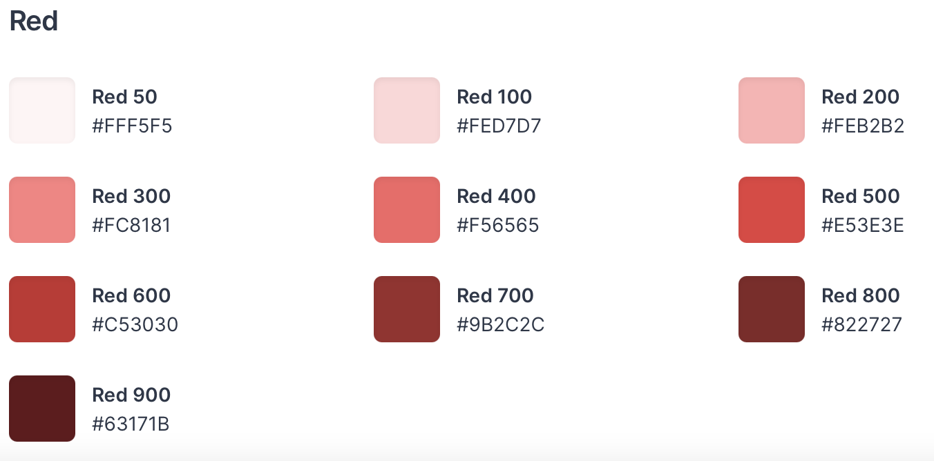
Custom Color Palette
Right out of the box, Chakra UI provides us with some nice looking colors. If you dive deeper into the colors, you'll notice that each color has a value from 50 to 900. This is so it works well with the colorScheme property and the color mode. You can create your own custom color palette such as a brand color palette but naming it and then passing in hex values for each of the values. You'll want to make 50 your lightest color and work your way darker for best results.
custom_brand: {
        50: '#FFF29F',
        100: '#FFEE80',
        200: '#FFEA60',
        300: '#FFE540',
        400: '#FFE120',
        500: '#FFDD00',
        600: '#DFC100',
        700: '#BFA600',
        800: '#9F8A00',
        900: '#806E00'
    }
<Button colorScheme="custom_brand" size="xs">
  Button
</Button>
Conclusion
Did you know all 5 of these advanced Chakra UI tricks? If so leave a comment down below!