You probably noticed that without any configuration on our part, the Chakra UI components look beautiful. That is because we are provided with a default theme out of the box. You can customize this theme easily, which we'll see in the next module, but for now let's take a deeper look at the default theme so we can better understand it.
Colors
Chakra UI comes with a set of default colors. If you are familiar with Tailwind CSS, this should look familiar as the Chakra UI defaults are heavily inspired by Tailwind CSS.
Using colors is simple. They range from 50 to 900 in value. Take a look at the gray value below.
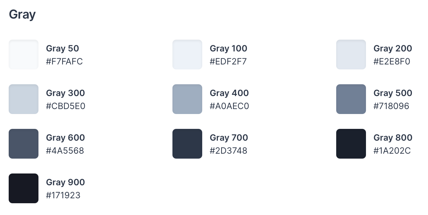
See all colors on Chakra UI's website.
If you want to use gray 400, you would use it like so:
<Text color="gray.400">I am gray text</Text>
As you can see, we have a Chakra UI Text component which lets us define the color through the color prop.
Typography
There are 5 css properties in the default typography section.
- Fonts (Font Family)
- Font Sizes
- Font Weights
- Line heights
- Letter Spacing
Fonts Default Config
export default {
  fonts: {
    body: "system-ui, sans-serif",
    heading: "Georgia, serif",
    mono: "Menlo, monospace",
  },
Font Sizes Default Config
export default {
  fontSizes: {
    xs: "0.75rem",
    sm: "0.875rem",
    md: "1rem",
    lg: "1.125rem",
    xl: "1.25rem",
    "2xl": "1.5rem",
    "3xl": "1.875rem",
    "4xl": "2.25rem",
    "5xl": "3rem",
    "6xl": "3.75rem",
    "7xl": "4.5rem",
    "8xl": "6rem",
    "9xl": "8rem",
  },
};
Font Weights Default Config
export default {
  fontWeights: {
    hairline: 100,
    thin: 200,
    light: 300,
    normal: 400,
    medium: 500,
    semibold: 600,
    bold: 700,
    extrabold: 800,
    black: 900,
  },
};
Line Heights Default Config
export default {
  lineHeights: {
    normal: "normal",
    none: 1,
    shorter: 1.25,
    short: 1.375,
    base: 1.5,
    tall: 1.625,
    taller: "2",
    "3": ".75rem",
    "4": "1rem",
    "5": "1.25rem",
    "6": "1.5rem",
    "7": "1.75rem",
    "8": "2rem",
    "9": "2.25rem",
    "10": "2.5rem",
  },
};
Letter Spacings Default Config
export default {
  letterSpacings: {
    tighter: "-0.05em",
    tight: "-0.025em",
    normal: "0",
    wide: "0.025em",
    wider: "0.05em",
    widest: "0.1em",
  },
};
Breakpoints
Breakpoints allow us to easily make responsive components. They simply render to media queries.
export default createBreakpoints({
  sm: "30em",
  md: "48em",
  lg: "62em",
  xl: "80em",
  "2xl": "96em",
})
Spacing
For spacing, we have padding, margin, and top, left, right, and bottom.
export default {
  space: {
    px: "1px",
    0.5: "0.125rem",
    1: "0.25rem",
    1.5: "0.375rem",
    2: "0.5rem",
    2.5: "0.625rem",
    3: "0.75rem",
    3.5: "0.875rem",
    4: "1rem",
    5: "1.25rem",
    6: "1.5rem",
    7: "1.75rem",
    8: "2rem",
    9: "2.25rem",
    10: "2.5rem",
    12: "3rem",
    14: "3.5rem",
    16: "4rem",
    20: "5rem",
    24: "6rem",
    28: "7rem",
    32: "8rem",
    36: "9rem",
    40: "10rem",
    44: "11rem",
    48: "12rem",
    52: "13rem",
    56: "14rem",
    60: "15rem",
    64: "16rem",
    72: "18rem",
    80: "20rem",
    96: "24rem",
  },
}
Sizes
The sizes properties refer to width, height, maxWidth, minWidth, maxHeight and minHeight styles.
export default {
  sizes: {
    ...theme.space,
    max: "max-content",
    min: "min-content",
    full: "100%",
    "3xs": "14rem",
    "2xs": "16rem",
    xs: "20rem",
    sm: "24rem",
    md: "28rem",
    lg: "32rem",
    xl: "36rem",
    "2xl": "42rem",
    "3xl": "48rem",
    "4xl": "56rem",
    "5xl": "64rem",
    "6xl": "72rem",
    "7xl": "80rem",
    "8xl": "90rem",
    container: {
      sm: "640px",
      md: "768px",
      lg: "1024px",
      xl: "1280px",
    },
  },
}
Border Radius
Border radius is a property that allows us to easily set the border radius of any component.
export default {
  radii: {
    none: "0",
    sm: "0.125rem",
    base: "0.25rem",
    md: "0.375rem",
    lg: "0.5rem",
    xl: "0.75rem",
    "2xl": "1rem",
    "3xl": "1.5rem",
    full: "9999px",
  },
}
Z-Index
Finally, we have z-index. Chakra UI recommends solving stacking without z-index. However, there are times where z-index will come in handy.
export default {
  zIndices: {
    hide: -1,
    auto: "auto",
    base: 0,
    docked: 10,
    dropdown: 1000,
    sticky: 1100,
    banner: 1200,
    overlay: 1300,
    modal: 1400,
    popover: 1500,
    skipLink: 1600,
    toast: 1700,
    tooltip: 1800,
  },
}